Chapter 1 Opening Remarks
smplot2’s key contributions are shortcut functions that generate elegant plots, which are aesthetically appropriate for the format of scientific journals, and key functions that can create and annotate a composite figure (subplotting), the latter of which is described in Chapter 7 in detail.
1.1 Which sections to read
If you are a proficient R user, I suggest that you read Chapters 7 (sections 7.4-7.7), 11 and 12 because all other sections describe basics of R as well.
Chapters 8-10 describe some introductory topics of data analysis that I often use in my research, and they have been written for the students that I supervise. Although the chapters might be useful for those in psychology and medicine, these do not discuss about data visualization.
If you are a smplot user, you can either use its tutorial website (https://www.smin95.com/dataviz0) and continue to use smplot or modify your codes so that it works with smplot2. If you decide to use smplot2, I suggest you that you delete smplot. Also, I suggest that you read Chapters 11 (especially the sub-section: How ... parameter and xxx.params work) and 12 to understand the changes that have been made to the new package rather than to read the book from the beginning.
remove.packages("smplot")If you are a newcomer, then you can just start reading from the next chapter.
1.2 How to use this guide
With more than 300 examples, this documentation guide serves as a “gallery” of plots that can be generated with smplot2.
CTRL + F is your friend! No need to linearly read this guide from cover-to-cover. You can save your time by searching for the key word or function’s name of your interest, reading its description, finding some examples that you like, and then using them for your own data. This might be the best way to get familiarized with the functions of smplot2.
1.3 News
2024-05-28: Version 0.2.3 (Available on CRAN)
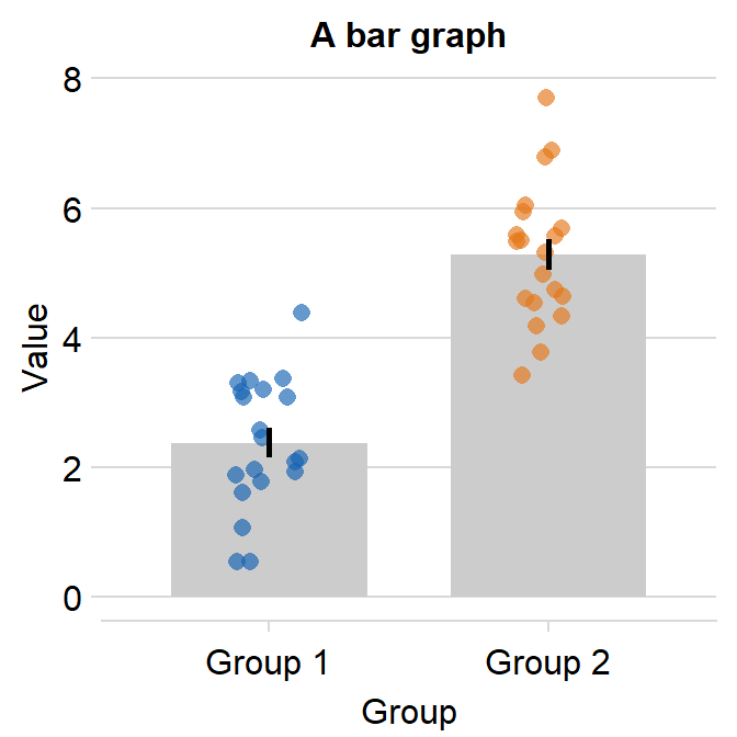
- Defaults of visualization functions are now kept even when users call upon list() for each argument unless users directly replace them with another input value. For example, to change the transparency of the bar and keep the defaults of
sm_bar(), users can only re-specify the alpha value as shown below.
ggplot(data = df, mapping = aes(x = Day, y = Value, color = Day)) +
  sm_bar() +
  scale_color_manual(values = sm_color('blue','orange')) +
  ggtitle('Default') -> p1

ggplot(data = df, mapping = aes(x = Day, y = Value, color = Day)) +
  sm_bar(bar.params = list(alpha = 0.3)) +
  # no need to write
  # bar.params = list(alpha = 0.5, width = 0.7, color = 'transparent', fill = 'gray80')
  scale_color_manual(values = sm_color('blue','orange')) +
  ggtitle('Default with new alpha') -> p2

sm_put_together(list(p1,p2), ncol=2, nrow=1, tickRatio=1)